 |
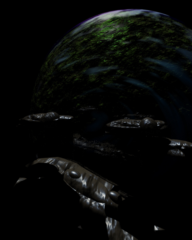
Chapter 5v5: This chapterscreen is a real bitch for Bryce.
If I get nearer to those ship the textures look crappy... If I do a little lighting the surface of the planet starts reflecting those ships(!). |
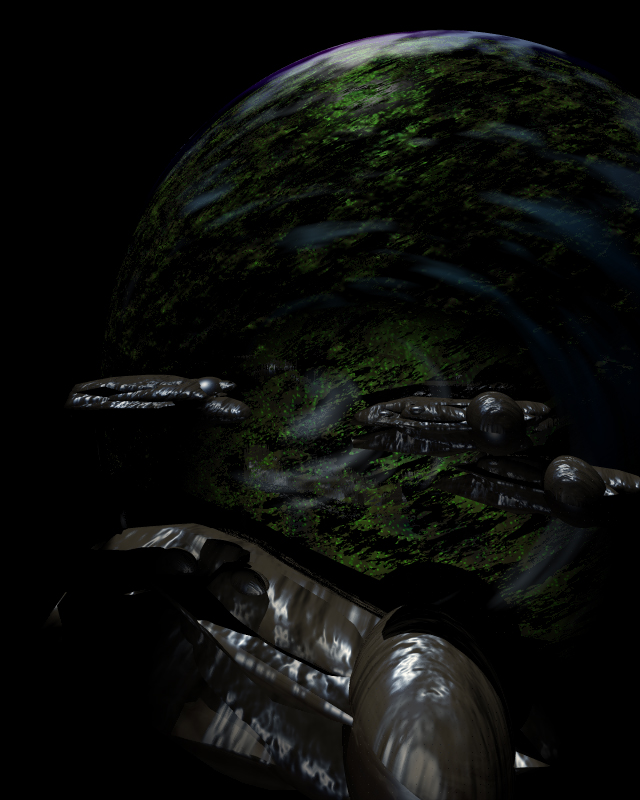 |
Chapter 5v6: If I do more lighting those ships look even worse.
Not to mention the planet. |
 |
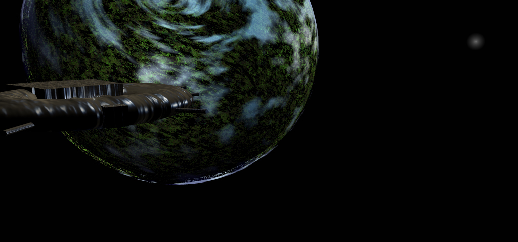
Chapter 6v7: Just for the proportions... Is this ok?
I personaly hate the ship and the planet in the back. Only the moon is close to ok. It has to be somewhat more blurred. |
 |
| Chapter 7v2: Uh, this is still very far away from beta. The lighting on the planet is shit, the station needs a different texture and probably another perspective. Just tell me if the proportions are what you imagined. |
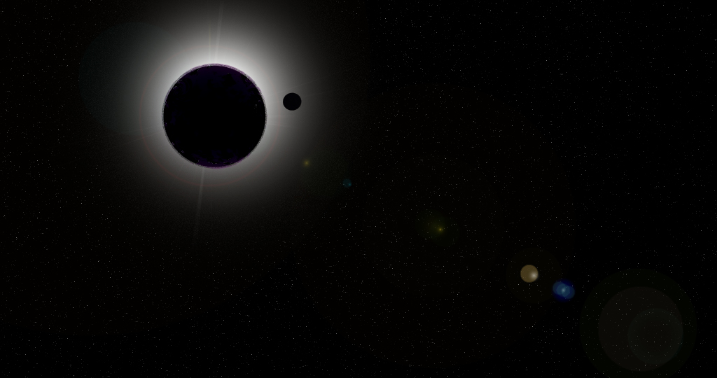 |
| Landscape01 v2v2: I guess the lensflare is too extreme, but I can remove it. |
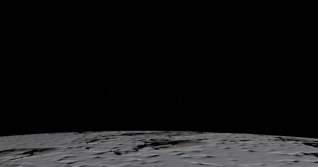 |
| Landscape04 v1v2: This ok? I guess the proportions are better now. I could also make it a little more blurred on the side that's further away from our point of view... |
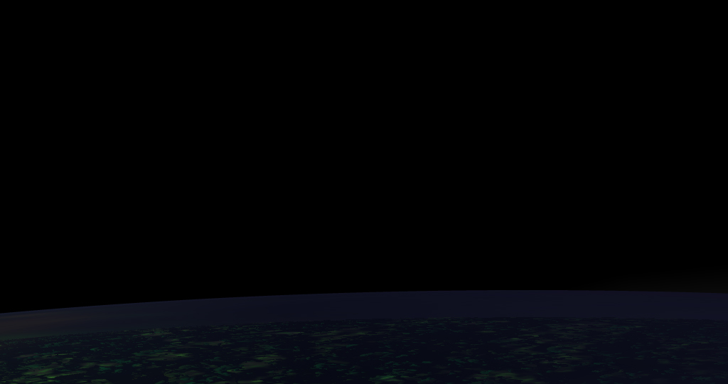 |
| Landscape05 v4v2: These are two versions of the night-side of Lh'owon. |
 |
| Landscape05 v5v2: I can't decide which one's better. |
 |
| Landscape06 v3v2: This is the sun-side of Lh'owon. Needs a lense-flare of course. :) |